Mott’s Digital Shelf
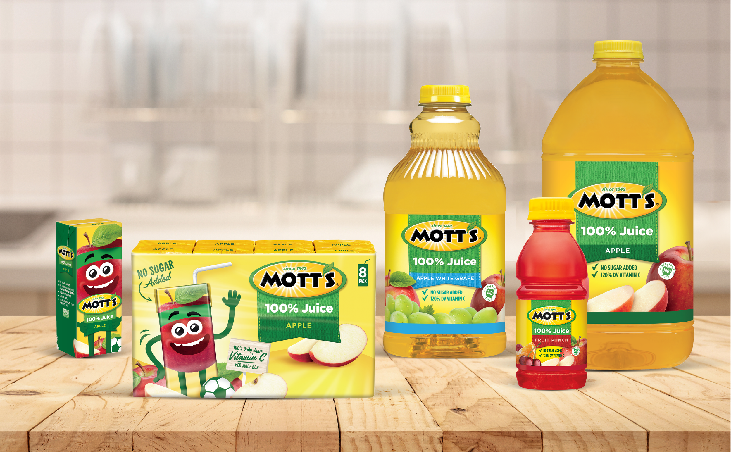
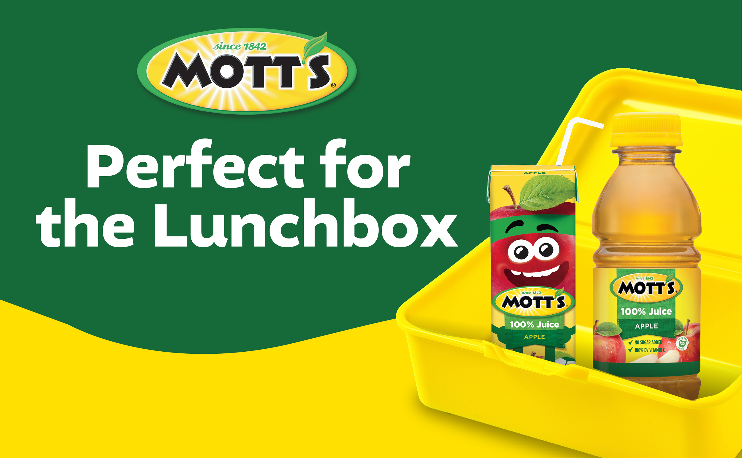
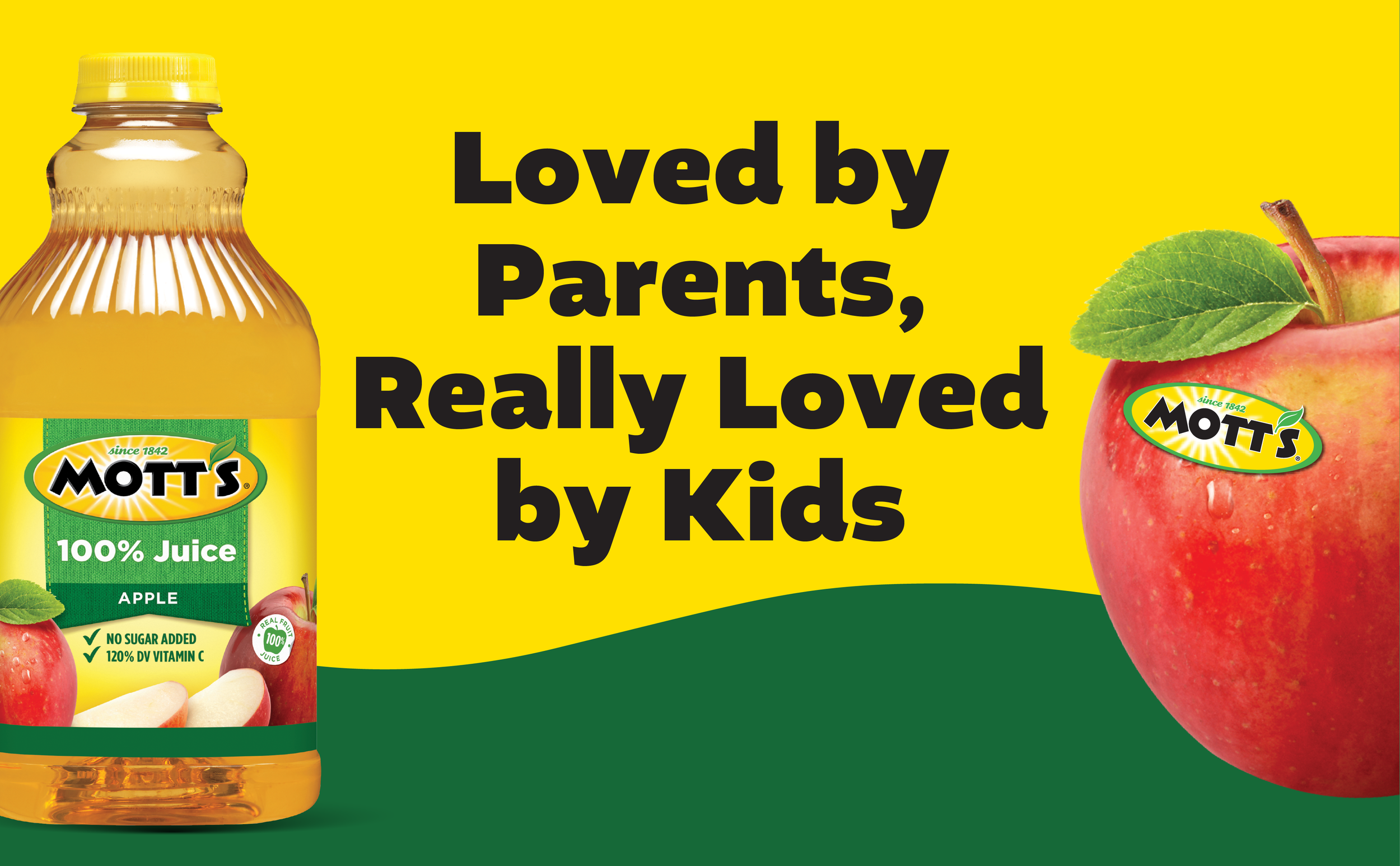
Mott’s brand wanted to enhance their A+ content and PDP images for their core products and sub-lines. The goal was to create a cohesive, digital brand presence with consistent language and visuals to help customers visualize and understand the product, ultimately driving purchase intent by showcasing variety, benefits and quality.
Creative Direction + Management


100% Juice | A+ Content and PDP images
For Mott’s 100% Juice line, I focused on showcasing the brand’s core colors and graphics across various pack types and flavors, ensuring a cohesive and visually appealing presentation of its signature products.


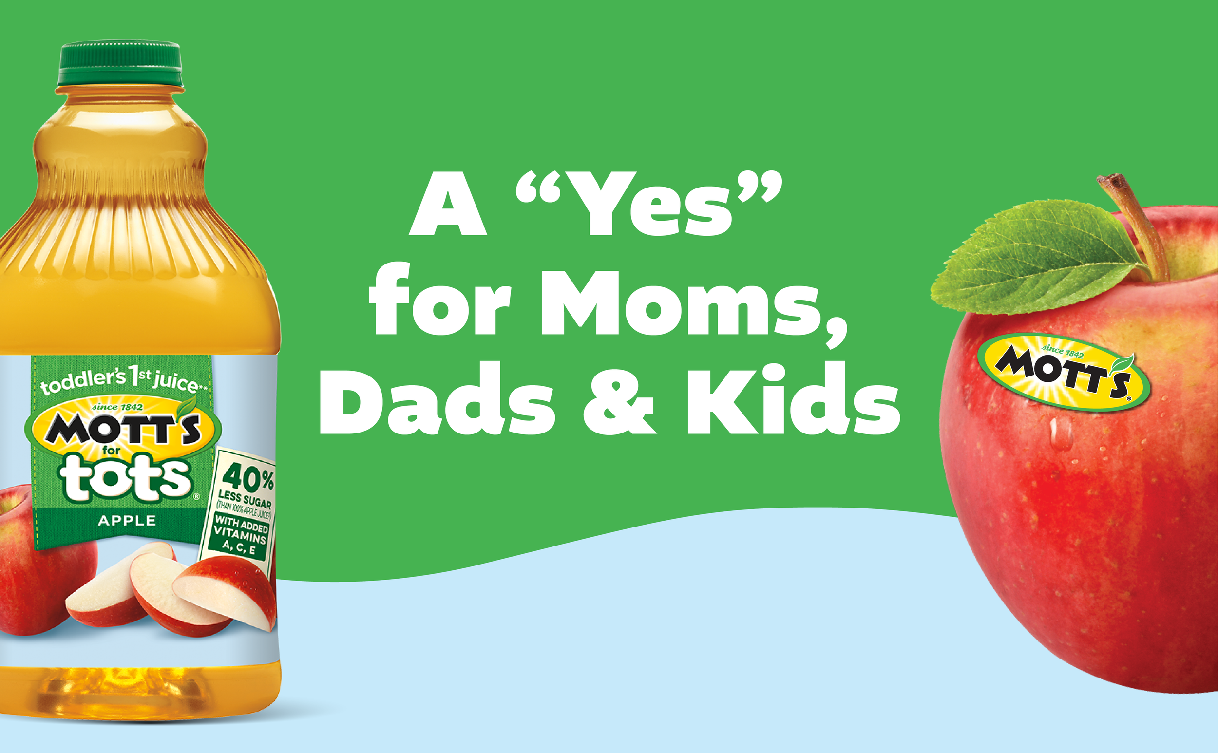
Mott’s For Tots | A+ Content and PDP images
For the Mott’s for Tots line, I incorporated playful graphics from the packaging to add a fun, kid-friendly touch while maintaining key elements of the brand’s core look and feel.
![24-3101_Motts_EMC_Banners-LightJuice-R1 [Recovered]_NSA_Family_970x600.png](https://images.squarespace-cdn.com/content/v1/67cc34ef7674373f938f09d3/68805d43-b503-4e98-b79c-a28f8f32c918/24-3101_Motts_EMC_Banners-LightJuice-R1+%5BRecovered%5D_NSA_Family_970x600.png)
![24-3101_Motts_EMC_Banners-LightJuice-R1 [Recovered]_NSA_RealApples_970x600.png](https://images.squarespace-cdn.com/content/v1/67cc34ef7674373f938f09d3/4ff3ee34-008f-4afa-8984-c7ca1d6ec265/24-3101_Motts_EMC_Banners-LightJuice-R1+%5BRecovered%5D_NSA_RealApples_970x600.png)
Light | A+ Content and PDP images
For the Mott’s Light sub-line, I preserved the integrity of the core graphics while adjusting the color palette to better reflect the 'light' and reduced-calorie nature of the products.


