
7Up Endless Summer
7Up has successfully launched many, popular limited edition flavors and behold, another exclusive flavor that needed show-stopping packaging that captured the essence of summer.
Concept Development | Packaging Design | Illustration

Concept Development
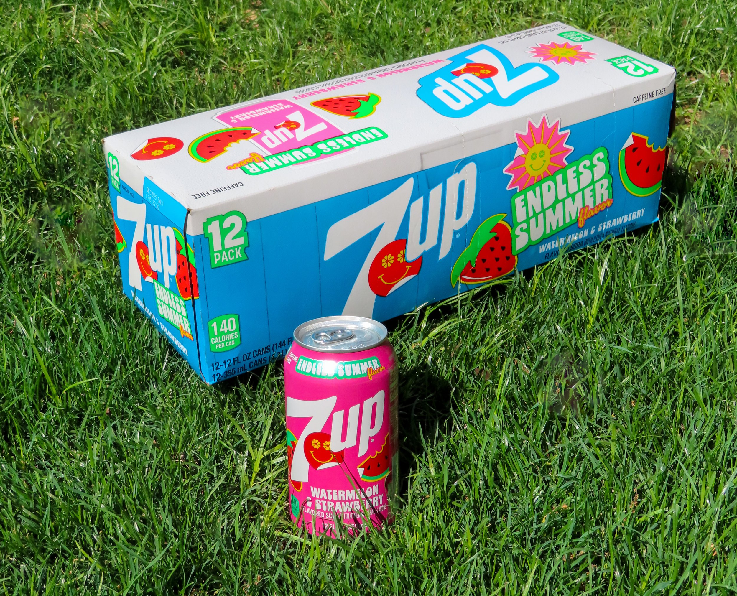
When images of the new Watermelon & Strawberry flavor began surfacing, the question on everyone’s mind was: Why a blue box with pink cans?
Now that the flavor has officially launched, the reason behind the design becomes clear. The blue overwrap is inspired by the iconic blue cooler we’ve all seen – whether in the back of a pickup truck, sitting in a garage, or set up at a picnic. The design incorporates the blue cooler as a backdrop, serving as the base for a fun collage of brand and flavor “stickers,” each representing the fun flavors of the drink and its connection to those summer memories.
We wanted to capture the nostalgia of summer, a feeling that the blue cooler instantly evokes. A sip of this refreshing Watermelon & Strawberry soda transports you right back to those moments so the vibrant pink can inside reflects those bursting flavors.


Zero Sugar
7Up’s core line of Zero Sugar follows a specific design system to communicate the "zero sugar" message clearly. While this flavor and design are limited, it was important to maintain the integrity of the Zero Sugar line to ensure consistency and drive shopability. Keeping the established design elements intact helped reinforce the product’s positioning, even within a special-edition offering.


